Appdynamics controller UI is very versatile, responsive and easy to use. But at times, it might look like you are beating around the bush but not getting to what you really want. For example, you can easily get lost in the amount of transaction snapshots available to you. (All you have to do is use the ‘search’ box at the top right to filter out the Transaction snapshots). In this tutorial, I’ll show you the most frequently used parts of the Controller UI.
The opening Screen

The Flow map (the mighty Dashboard that you don’t have to build)
Flow maps are one of the most useful features of AppDynamics. Gone are the days were you have to build your own dashboards from scratch (Note that Appdynamics still lets you create custom dashboards if you need to). AppDynamics automatically discovers all the subsystems associated with your application and lays them out nicely. Frankly, many times you will be surprised to see that your application was talking to a certain backend (Once I found a production application talking to a non-prod Database, yikes).
Flow maps are presented at different levels – Most useful ones are Application, Tier, Node and Business transaction.
An Application Flow map:
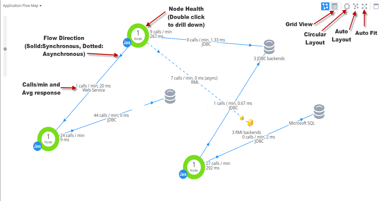
You can customize the flow map to some extent. For example, you can show based on certain performance thresholds. If you want to customize, I recommend creating a new flow map first and then editing it. You can create a new flow map by clicking on ‘Manage my flowmaps’ under ‘Tier Flow maps’ drop down list.
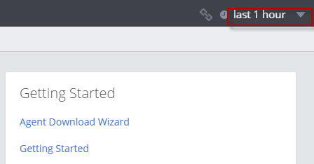
Setting the time range
The range can be set by the drop down button at the top right. This time range will apply to all flow maps and dashboards.
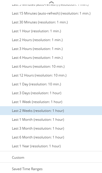
You can pick any of the predetermined time frames
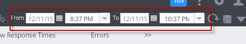
You can enter a custom time range instead of choosing the predefined range
You can also ‘save’ a time range so you can quickly ‘select’ during later runs.
Note about Time zone:
The controller UI always shows the local timezone where the UI is being run (mostly, it is your PC). When Appdynamics agent sends data to the Controller, it applies a UTC offset. Controller UI takes care of converting the time to the local time.
Note about frequency of data points:
Note that Appdyanmics will roll up data points for larger time ranges. For example, when you select data for ‘last 1 hour’, the data points are showed for every minute. However, as you increase the time range, the granularity reduces as follows:
Less than 4 hours: 1 minute
Between 4 hours and 48 hours: 10 minutes
More than 48 hours: 60 minutes
Viewing Transaction Snapshots
Transaction Snapshots are extremely useful to drill down on a particular business transaction to uncover bottlenecks. This is where you can get down to the method level to amaze your developers.
A transaction snapshot is set of monitoring data related to a particular Business Transaction, end-to-end. For example, if ‘placeOrder’ is categorized as a BT (Business Transaction) in your Appdynamics environment, a Transaction snapshot of ‘placeOrder’ will show all the components involved in the snapshot along with their response times. Quite often this includes Application Servers, Databases, Message queues and other remote services, as applicable.
Appdynamics periodically takes snapshots (by default every 10 minutes), or when there is an increase in the number of slow transactions (configurable), or when a BT runs into an error condition. You can also initiate a manual diagnostic session that will take snapshots too. I will cover these configurations in detail in another post. For now, let us focus on how to read a Transaction Snapshot.
To list available Transaction Snapshots, click on ‘Transaction Snapshots’ in the top menu bar in Application,Tier,Node or BT Dashboard
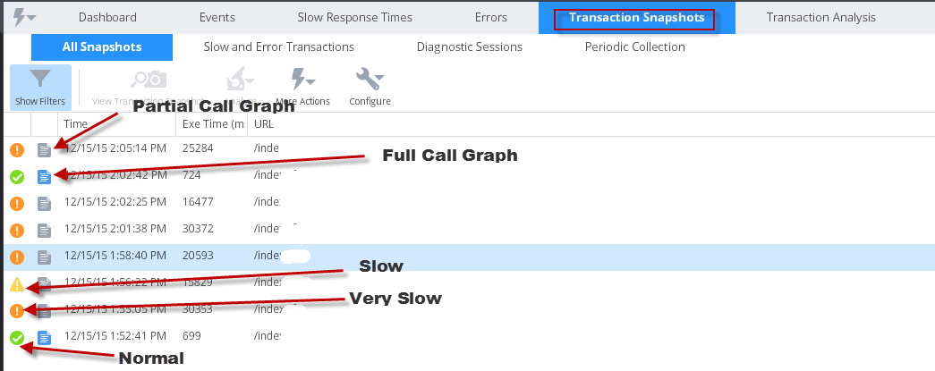
You can double click on any transaction snapshot of interest to get to the flow map of the transaction snapshot
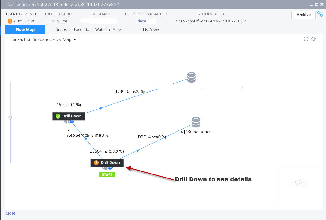
Upon drilling down, you can see several key metrics about the snapshot. The most useful ones are ‘HotSpots’ which sorts all the calls involved in the snapshot by the response time.
You can also view the SQL Calls involved in this transaction.
Here are the available screens (Not all the screens will have data, depending on what is available)
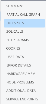
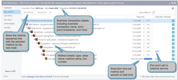
Image Source: www.appdynamics.com
Viewing Errors and Exceptions
Appdynamics automatically captures Errors and Exceptions as it occurs in the Application. An error is any error event such as a fatal error trying to connect to a DB server, or an HTTP error code such as ‘500 internal server error’. An exception is a thrown by the application and if it is in the log4j threshold of ERROR or FATAL, it is captured by Appdynamics. For all practical purposes, you need to review both errors and exceptions.
Note that you can create custom error monitoring by providing the class name and method name that you intend to use for Error detection. When this method is invoked, it will be considered an error.
The Errors dashboard is available from several places. But the easiest way is to click on Troubleshoot from the left pan and select Errors
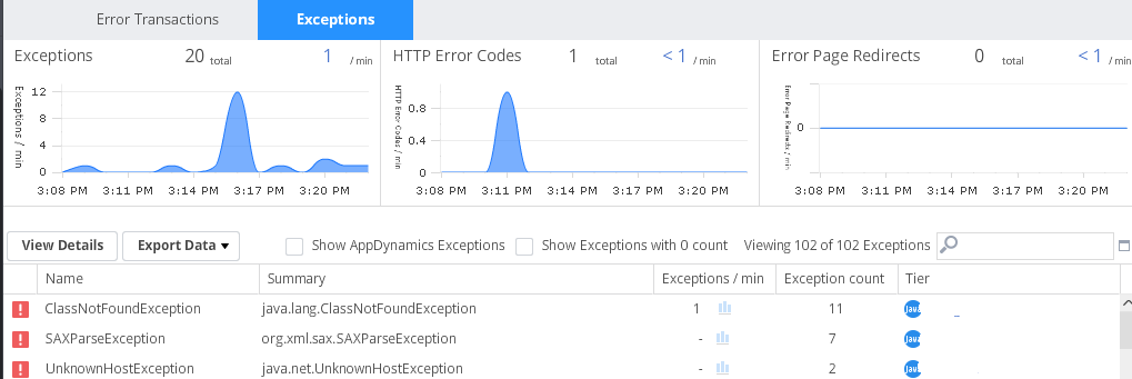
You can drill down on any of the errors either by double clicking the error or by selecting the error and clicking ‘View Details’.
In the resulting screen, you can click on ‘Strack Traces for this Exception’ to view the full stack trace (and this is how you amaze the developers)
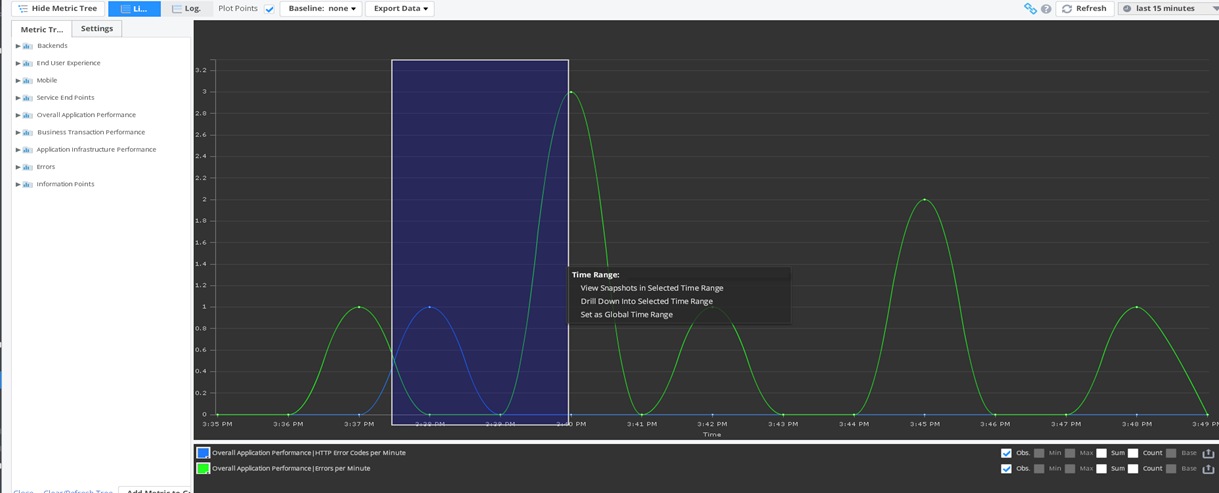
Metric Browser
Metric browser provides a metrics-oriented view of all metrics collected for a given application. It lets you navigate the metrics via an easy to use Metric tree. You can pick any metric from the tree and drop it in the graph window on the right.
To access the Metric Browser, you can double click on any graph from any dashboard. Or you can navigate to ‘Analyze’ on the left pane and select ‘Metric Browser’.
Metric Browser has two panes. On the left pane, you will see a Metric tree, categorized logically. And on the right side you will see the graph.
You can drag and draw a period for which you need more details. A pop window appears to let you choose the desired option.
Comparing releases
This is one of the best features of Appdynamics. You can pick two different time ranges and compare vital statistics side by side in a single screen. This is immensely useful for monitoring your applications after a major application release.
To access ‘compare releases’ screen, simply navigate to ‘Analyze’ -> ‘Compare releases’
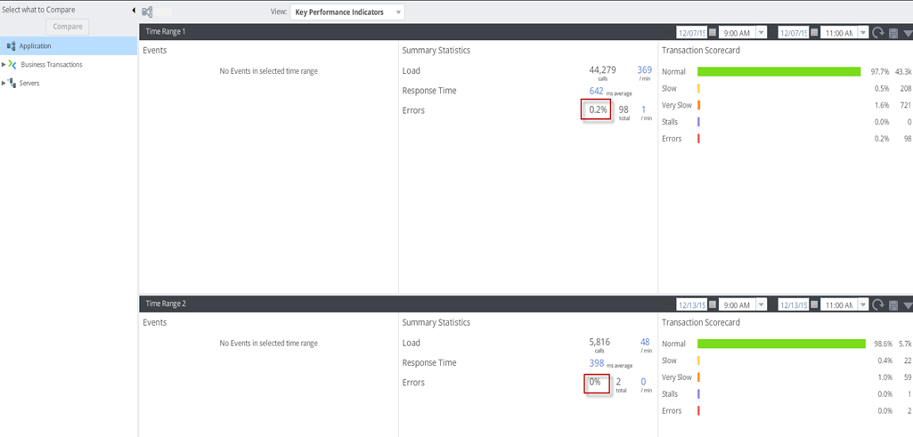
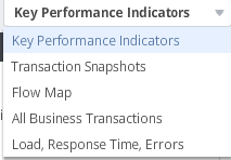
You can select what you want to compare from the list. Mostly ‘Key Performance Indicators’ is what you need. Other options available are shown below:
There you have it. Appdynamics Controller UI is very exhaustive yet very elegant and agile. While there are tons of screens and configuration options, the material I presented here in this document should be good to get you started, and perhaps solve a problem or two in your environment.
Happy Monitoring !!
Comments on this entry are closed.